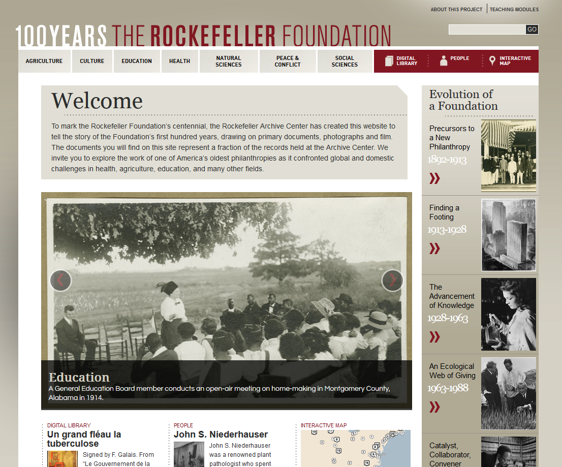
I have been thinking a lot about web design and usability recently and thought it would be helpful to catalog websites that I think look really good and that I look at for ideas/inspiration as I tweak existing Omeka themes for the Northfield Historical Society.
I’m not really employing any set criteria, per se, about what sites are included or excluded – only that the site looks good and is very clear and functional. I noticed that many of these sites are information rich environments – I guess this makes sense because that’s the sort of environment I’m most interested in creating.
Bridges NYC | Postcards (http://bridgesnyc.com/postcards/)
This site runs on Omeka and is the closest (i.e. most doable) example that I’m following. I like the boxy navigation and how the images are featured on all the pages (collection view, item view, etc.). I also like the simple color scheme of black and gray.

University of Arizona Special Collections (http://speccoll.library.arizona.edu/)
Another good looking special collection page that offers clear navigation and instant ability to navigate the site. Again, sort of “blocky” and geometric with a gray color scheme.

Cleveland Historical (http://clevelandhistorical.org/)

100 Years – The Rockefeller Foundation (http://rockefeller100.org/)

DPLA (http://dp.la/)

On Being (http://www.onbeing.org/)
